
Wellness Web App
Dashboard Audit

Context
I performed an evaluation of a wellness app for life insurance policyholders (specific company name available upon request). User engagement on the Dashboard was low. And the number of return users only about 1% of the eligible user base. There was a need for a Dashboard redesign to make navigation more intuitive for users and increase return visits to the product.
Research Methods
View HotJar Videos
I watched and recorded findings of user activity and behavior on the health app. Data set of 50 different users. HotJar is a tool we use to record users' web sessions and then view how users operate and behave when working through our web app. This helps us determine if users are moving through as web app as intended or if there are areas of improvement or opportunities for better engagement.
Document Existing Navigation
I wrote out and list all of the navigation headings and webpages that make up our app. To understand all of the components of the dashboard and how they function today, a Trello board was created to list all of the app features and pages. Every component of our existing app and the category it sits under is documented on the Trello board titled Dashboard (CURRENT STATE). In addition to the Trello board, a visual user workflow of our existing app was created to illustrate how users move through our app from the dashboard, top navigation, and side navigation.
Review and List Observations
Draw conclusions from observations and report out to the rest of the team.
HotJar Key Findings

First navigation means where a user went to the very first hover/click of their experience. Distinction between features explored vs features used means some features were explored but not used. For example a user might click into add health record but then not actually complete the action and never click submit (so that’s why there might be discrepancies in the numbers).
• Most Used Features: mood, water, sleep, health record, workouts, food journal (also most are above the fold). Overall greater user page views for tracking features
• Frequent clicks on Leaderboard to check ranking and user desire to see more info about competitor’s profile and ranking.
• Lowest used features were content library, surveys, points, and rewards pages. For example with the Content Library 5 out of 50 users explored, 1 out of 50 user actually read an article. Points were used by 4 out of 50 users. Surveys were taken by 3 out of 50 users. And only one user redeemed their Rewards.
User Flow of Existing App

This is a visual representation of how the web app currently functions. User flow means the paths in which a user can move around the site. The success of a website or app is often contingent upon how well your modeled flows meet the needs of your targeted users (personas), as well as the needs of your business.
User Flow Key Findings
SPECIFIC FUNCTIONAL PATTERNS
The app has a very specific user pattern, which is:
Track health data
Earn points (shown as a flash notification)
View graphs and trends of health data
View insights (which is data correlations and its meaning)
Return to dashboard
Other functions user can do:
View points and leaderboard
View and claim rewards
Add friends
INCONSISTENCY FROM ONE FEATURE TO THE NEXT
Not all features follow the same user pattern.
Some features (food journal, workouts) allow you to track and immediately see graphs or insights.
Other features (water, sleep, mood) direct you back to the dashboard immediately after tracking and skip redirecting users to insights.
Some feature headings or titles are not consistent
Some pages have "Back to dashboard" at the top while others do not.
In some cases, a user is automatically re-directed back to dashboard after taking an action on a page.
REDUNDANCY
In the top navigation there is "Points" tab but also a circular points icon that both lead to the points page. The circular points icon is not clear or intuitive what it is or means until you click on it.
Redundancy in and of itself is not necessarily bad especially if its used to encourage desired user behavior. However in this instance the symbol isn't intuitive and rarely was used according to HotJar video findings.
FRAGMENTED
There are three different patterns depending on what you click.

Dashboard cards function with one pattern. You can log a health record on the page and stay on that same page.

Top navigation follows a different pattern by taking the user to the respective page.

Right side navigation options follow yet a third type of pattern where some cards will take the user to a new page and others are static.
Some features that are Dashboard Cards (mood, sleep, water) are not in the Top or Side Navigations.
Top Navigation and Side Navigation share the some of the same features (e.g., Workouts, Food Journal) but take you to different pages.
"Workouts" in the top navigation takes you to the Workout Summary or Trends page.
"Workouts" in the right side navigation take you to Track A New Workout page.
There is little visual indication of where you are as a user and how you move through or go back from one page to another.
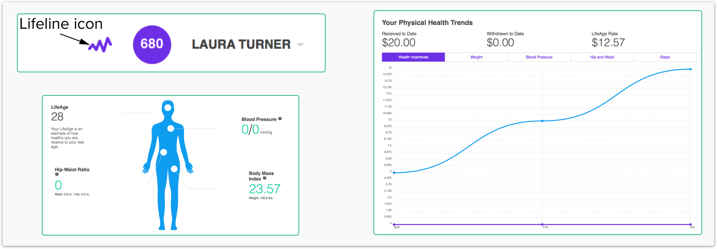
Buried Pages
Physical Health Trends can only be accessed by clicking on the human icon at bottom of dashboard or lifeline icon (squiggly purple line) in the top navigation. This is not evident to the user. According to HotJar videos, these two icons are rarely clicked on. Therefore, these pages are buried and rarely seen.
Dashboard Navigation + Content Structure Exercise

I conducted an exercise using Trello boards where the current site navigation and all web pages were documented and categorized to understand our existing user experience. The above Current State shows the Web App as is. I made the boards with each tab, and then under it are the categories. i.e. Rewards stands for all that is underneath the rewards tab on top nav.
Opportunities for Growth
Consistency with Dashboard card styles and patterns
Create a more connected experience
Consider the hierarchy of Dashboard
Create uniform patterns and style across all features
Display Insights in a more prominent way
Consistency with Dashboard Card Style & Patterns
Determine standard functionality of dashboard card. Then apply in a uniform way for every feature.
Here is one proposal:
Track health data directly on card without leaving dashboard
View graph of data directly on card without leaving dashboard (would flip automatically after new record submitted)
Click button to view further insights and then be directed to that feature's insights page
Click"Dashboard" in the top navigation to return to the dashboard
Create a More Connected Experience
Potentially could link similar pages together.
Based on HotJar footage, This Week’s Leaderboard on the side navigation gets attention; however, this is a static element. Users’ click on their rank and other users' rank on this Leaderboard but nothing happens because it is not linked to points or leaderboard. There is an opportunity to link this ranking list to a Leaderboard page that explains rankings. Or incorporate with points more cohesively.
Consider the Hierarchy of Dashboard
Based on HotJar footage, content that is above the fold on the app homepage gets the most click activity and engagement.
We should think about how we prioritize and order items on the Dashboard.
Create Uniform Patterns and Style Across all Features
Consistent in how we:
Name features (e.g. navigation heading, and page title headings)
Each feature page appears and is accessible for a user (e.g. tracking, graphs / insights.)
Users can track actions (e.g. some actions like water and sleep can only be tracked on dashboard but other actions can be tracked on a separate pages like workouts, health record, and food journal).
Users move from one feature page or sub-page to another.
Display Insights in a More Prominent Way
Currently Insights are embedded within dashboard cards and by being buried many users aren’t accessing Insights.
We can rethink how Insights are more accessible to users.
Other Areas to Clarify as a Company Before Moving Forward
1. What is the purpose of the dashboard cards?
Track actions?
Viewing user progress?
Previewing features and linking user to feature page?
2. What is the primary action we want the user to do on the dashboard?
Stay up-to-date on their progress? Be more Insights focused?
Keep tracking more actions?
Explore features?
3. How can the dashboard design be more like a "coach" (i.e., instructive)?
Voice, tone, style of user empty state (How do we get user to understand and take a first action?)
Voice, tone, style of user progress state (How do we get user to continue action.
Voice, tone, style, and timing of notifications
Design Recommendations

From that first Trello current state board, the same categories could be used and rearranged. One possible future state, more by main buckets of user actions i.e. track, learn, connect, earn.

A different model could be based more on Areas of interest i.e. buckets of topics/genres. These could be gathered from users during an initial on boarding where they mark their own areas of interest. Then the dashboard would be more personalized and tailored to their top interests.