A/B/C/D Testing
Message & Meeting Flow
Context
PeopleGrove wanted to drive current college students to message alumni to boost engagement on the platform. In addition there was a goal to increase the number of meeting requests that students make with alumni. I led a series of live moderated usability tests to measure a variety of designs and see which CTA to add a meeting request had highest success. I measured multiple prototypes with this framework called a System Usability Scale (SUS).
Prototype A
This approach involved the student user type first sending a message to an alumni user type and then afterwards seeing a modal with a confirmation of the email being sent and suggesting the user additionally request a meeting.
Prototype B
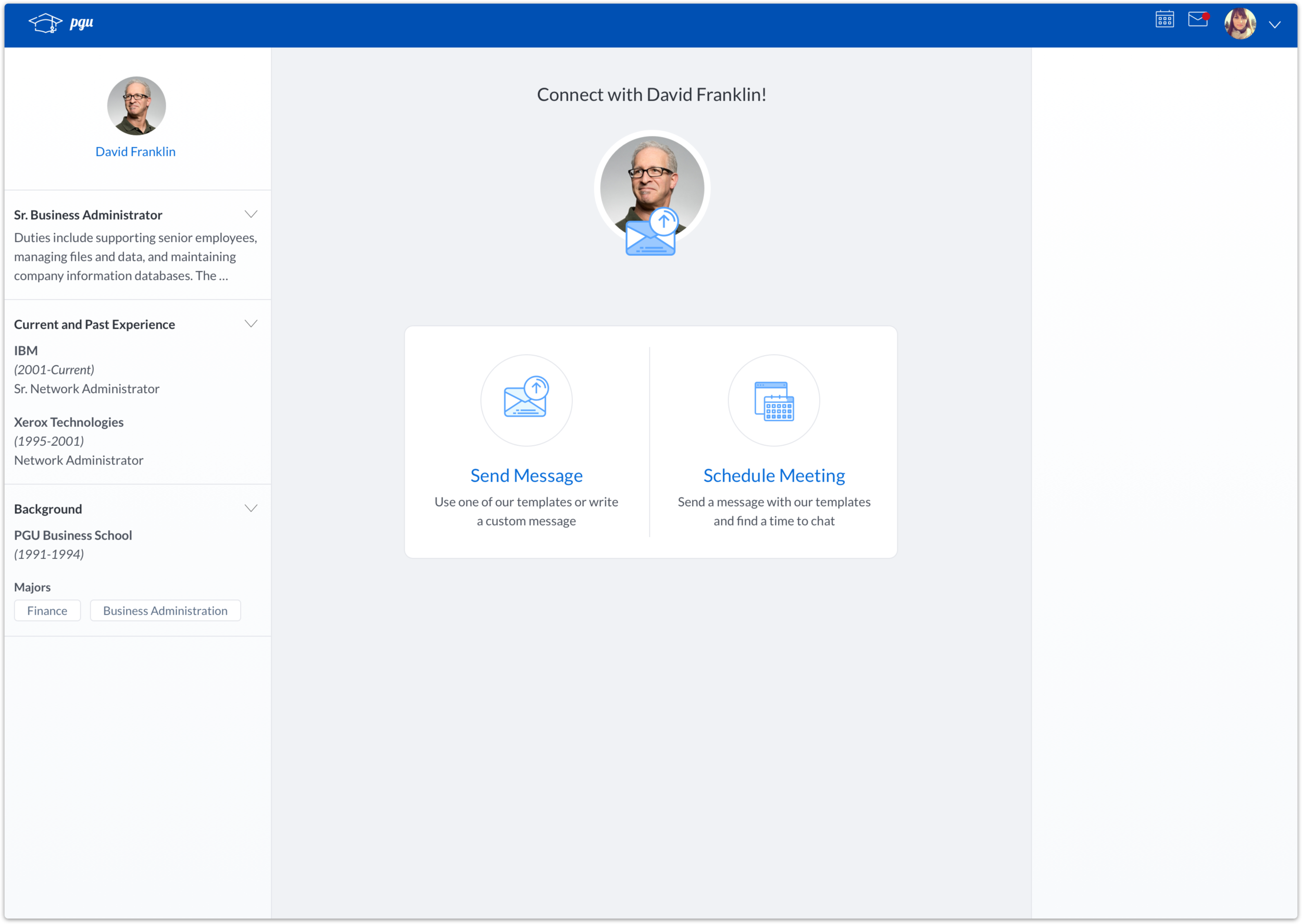
This approach involved letting the student user have an option at the very beginning to only send a message or elect to send both a message and meeting request at the same time.
Prototype C
This was another variation of a modal pop up after the message had been sent. The main variable here vs Prototype A was that available times to schedule a meeting were previewed immediately.
Prototype D
This was also a split view with a choice upfront for the user between sending a message or scheduling a meeting. There were slight UI differences between this and Prototype B especially with the way the meeting times were presenting later in the prototype.
Results
Here are the raw System Usability Score results. Prototype A and Prototype D performed the best. I ran an additional follow up test using this script and made a revised prototype based on user feedback and insights. We settled on the modal pop up vetted with certainty that we’d hit our objective of students sending both a message and a meeting request to an alumni. The last step would be A/B testing on the platform itself.


