
Student Homepage
User Testing & Redesign

Context
The homepage is the #1 most used feature, representing 65% of traffic and 45% of time spent on the PeopleGrove platform. I led user research and conducted initial product designs before transferring to another Product Designer for final polish. I worked in collaboration with a Product Manager to ensure the new designs would increase conversion, quality, Sales and Customer Success metrics.
After this user research was conducted and design improvements were made there were concrete improvements:
70% increase messages sent by new students in first 7 days
50% increase successful connections by new students in first 7 days
65% in messages sent by all students in first 30 days
20% in successful connections by all students in first 30 days
(all data pulled from Mixpanel)
Old Homepage Areas for Growth
The old designs hadn’t seen a facelift in years so it was time for an interface update. Additionally the engineering team was shifting from Angular to React. The old homepage had too many calls to action for users. With user research we also wanted to identify the best way to meet student user needs. Additionally many students reported not understanding that this platform was uniquely positioned for only current students and alumni of the same alma mater. From a UsabilityHub baseline test 4 of 15 (26%) of students understood the value prop, a third of participants said ‘networking’ but were vague, and the rest were way off in their understanding.
That seemed like a large miss because our value proposition is part of what makes the platform unique. Also because we are a white labeled company we wanted to make sure our clients, universities, could still have some customization without detracting from the overall UI.
Design Principles for New Homepage
Have ONE primary call to action and clear path to value (reduce clutter and set students up for success with connecting with alumni)
Clearly convey what PeopleGrove is and our value prop so its clear to users why and how they can use the platform to meet their needs
Allow for limited, thoughtful administrator customization
Consider pre and post connect states so that homepage feels dynamic and relevant after initial connection

Above is an example of the old homepage.
User Research
This was a multiple month project conducted via a two week sprint cadance. At various points stakeholders such as the CEO, CTO, Head of Product, engineer managers were consulted for feedback and buy in.

An overview of considerations and progression of deliverables featured below.

Identify User Segments
Define:
What are the biggest problems for key user segments that we can and should solve?
Possible segmentations:
By goal: job/internship seekers, explorers / wanderers, career switchers, networkers, wise mentors, etc)
By school year: under / upperclassmen, alumni
Generative Surveys
Exploratory questions to survey:
Do users already have goals in mind or do they need heavier guidance?
When do users’ problems meaningfully differ? Which user segments need to be treated differently? Which the same?
What are the most pressing / urgent problems by user segment?
What user problems can we effectively address on PeopleGrove?

Typeform survey of primary goal for using PeopleGrove platform. 38 current PeopleGrove student users surveyed on platform via a Chameleon integration.

100 current college students (non PeopleGrove users) surveyed via UsabilityHub about their primary academic or career goals.

Typeform survey, secondary goal results.

UsabilityHub secondary academic or career goals results.
Survey Results
Top student goals, representing ~80% of survey responses, are to:
Find an internship or job (26%)
Network with people in my industry or career path (21%)
Learn about different career paths (16%)
Set an academic / career goal (14%)
Wireframes
Based on survey results, then I proposed a few different wireframes. The concepts ranged from being module or “tile” based, exploring different ways of integrating the value prop/social proof, following a search approach for a mentor similar to “Airbnb”, having a one mentor spotlight, having a carousel based on anticipated student needs such as “preparation for grad school” etc. This is also where the concept of bookmarking an alumni and having them become saved in “your connections” section began and eventually was shipped. That allowed students to have immediate engagement with the homepage even if they weren’t ready to immediately message an alumni.


Next Round of User Testing
After receiving feedback from stakeholders such as the CTO, Head of Product, and Engineer Managers then I selected the top 3-5 student dashboard wireframes and value proposition copy.
I ran usability tests to see:
Which design best conveys what is PG + value prop using 5 second test & preference test
If it is obvious how to connect with an alumni by using first click tests

3 Different Approaches Preference Test
Learning goal: Which of these action types do students prefer:
1) Career search (by city, industry, role)
2) Browse alumni (that have been previewed one at a time)
3) CTA to search the alumni network
Hypothesis: One of the action types will be preferred the most by students.
Experiment: Preference test where students pick which action type they prefer.
Metric: Start with 30 testers. 1 of the 3 options gets +50% of the votes.
Testing audience: 30 college students, aged 18-21
Preference Test Results
Browse alumni (that have been previewed one at a time) what we internally called the “Tinder” approach.
Full UsabilityHub results.


“Tinder” browse feedback (53% of votes)
“The picture adds a personal touch”
“You immediately feel connected, the picture feels personal automatically. “
“What stood out is that the information/people available are immediately presented and you can see their details. It makes the process seem a lot more reliable and quick once you can physically see and get an idea of what you're planning to invest in.”

Input search feedback (33% of votes)
“This one gave the most easy to understand way to start contacting alumni.”
“I liked the obvious input panel where I can quickly fill in my info and get to the program”
“I like that you are able to filter the alumni who would best be able to help you.”
![Gusto feedback (13% of votes)“This seems like the most put together version of the site. The first design [search] looked plain and the third design [tinder] looked overloaded. This version fits it well.”](https://images.squarespace-cdn.com/content/v1/5e220407e3396f1f4ab01b82/1581968229323-HD3B8WZIEYBDL4JLS3A0/gusto.png)
Gusto feedback (13% of votes)
“This seems like the most put together version of the site. The first design [search] looked plain and the third design [tinder] looked overloaded. This version fits it well.”
Concept Validation Survey
Learning goal: Which of these action types do students prefer 1) Search , 2) Browse, 3) CTA to search the network. The purpose of this survey was to confirm the direction to move forward without using visual designs.
Hypothesis: One of the action types will be preferred the most by students.
Experiment: Preference test where students pick which action type they prefer.
Metric: Start with 30 testers. 1 of the 3 options gets +50% of the votes.
Testing audience: 30 college students, aged 18-21

The majority of students surveyed preferred the action of browsing mentors.
Value Prop 5 Second Click Tests
Learning goal: Which design best conveys our value prop to students?
Hypothesis: One of the value prop designs will effectively convey PG’s value prop
Experiment: Test 3 designs in 5 second tests with a recall question and a short answer. Question: “What do you think you could do on this site? Please be as detailed as possible.”
Metric: 80% of students will understand the value prop for a given design
Testing audience: 15 college students, aged 18-21 x 3 tests


First Click Test
Learning goal: With the new designs will there be a fairly clear call to action that will drive connections?
Hypothesis: Most students will click somewhere within the mentor card
Experiment: Where would you click first? Then the actual click occurs and a second short answer “Why did you want to click there?”
Metric: 70% of students will click within the mentor card or related to sending messages/connections
Testing audience: 30 college students, aged 18-21
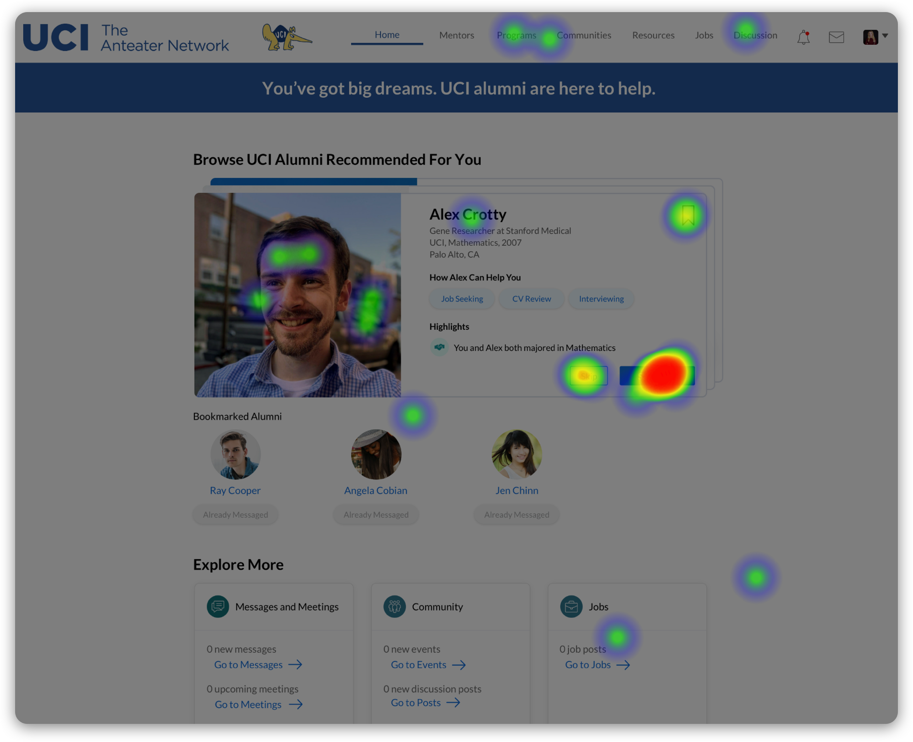


80% of first clicks occur within the alumni card “Say hello” button, Alumni photo, “Skip” button, Bookmark, Alumni name.
Final Designs
After I finished the initial research, wireframes and product design work, another Product Designer polished the designs as seen in the carousel below. These are the designs that shipped. Main additions were an upcoming meetings module, nurture your connections section (which basically are reminders to students about actions they need to take to follow up with alumni) to drive user engagement.


Success Metrics
70% increase messages sent by new students in first 7 days
50% increase successful connections by new students in first 7 days
65% in messages sent by all students in first 30 days
20% in successful connections by all students in first 30 days